An S Curve in Primavera refers to a graphical representation of a project’s progress, costs, or resources plotted over time. It’s called an “S Curve” because, when plotted, the line typically forms an “S” shape, slow progress at the beginning, rapid progress in the middle, and slowing down towards the end.
What are the typical uses of an S Curve in construction scheduling?
1- Progress Tracking:
S Curves allow project managers to visually compare planned progress with actual progress over time. This helps identify delays early and monitor whether the project is on schedule.
2- Cost Control:
By plotting planned versus actual costs, S Curves highlight any budget overruns or savings as the project moves forward.
3- Resource Management:
S Curves can be used to track the allocation and consumption of resources (like labor, equipment, or materials), ensuring they’re used efficiently and spotting any over- or under-utilization.
4- Forecasting and Trend Analysis:
They help in forecasting future performance by showing trends, which supports better decision-making and early intervention if problems are detected.
5- Reporting to Stakeholders:
S Curves provide a simple, visual way to communicate project status, progress, and issues to clients, contractors, and other stakeholders.
Why S Curves matter?
S Curves play a critical role in project management, especially in construction scheduling, because they provide project teams with an at-a-glance understanding of a project’s performance. Instead of getting lost in spreadsheets and numbers, project managers can instantly visualize how work, costs, or resources are progressing compared to the plan.
When an S Curve is used, any deviation between the planned and actual lines stands out immediately. This gives managers the chance to investigate and address issues—such as delays or budget overruns—before they escalate.
The clear, visual nature of S Curves also makes them an ideal communication tool for stakeholders, who may not have the time or expertise to interpret detailed schedules or cost reports.
Ultimately, S Curves support proactive management.
They allow for continuous monitoring throughout the project lifecycle, making it easier to forecast future trends, justify decisions, and report status with confidence.
This all leads to better project outcomes, fewer surprises, and happier clients.
How S Curves Work in Primavera P6?
Primavera P6 creates S Curves by gathering project data (like planned vs. actual progress, costs, or resources) and plotting it over time. Here’s the general process:
Exporting for Advanced Analysis:
For more advanced or customized S Curves, you can export data from P6 to Excel and build detailed graphs or combine multiple data types.
Project Data Input:
You build your project schedule in P6, adding activities, assigning resources, and setting up cost and baseline data.
Baseline and Updates:
The baseline (planned values) is set, and as the project progresses, you regularly update the schedule with actual progress and costs.
Data Accumulation:
P6 automatically accumulates the planned and actual values for each period (day, week, month), so you can see totals at any point in time.
Generating S Curves:
Using built-in reporting or the “Activity Usage Profile” and “Resource Usage Profile” tools, P6 plots the cumulative data as a line chart—the classic S Curve.
Analysis and Comparison:
The S Curve lets you visually compare planned vs. actual performance. If the actual curve starts to fall below the planned curve, that’s a signal there may be delays or cost overruns.
P6 makes it easy to turn project data into S Curves so you can quickly track, analyze, and communicate project performance throughout the lifecycle.
How to generate an S Curve in Primavera P6? (The Hard Way)
1- Open Your Project
Start Primavera P6 and open the project you want to analyze.
2- Set or Confirm Your Baseline
Make sure you have a baseline set. The baseline serves as your planned progress or cost reference.
3- Update Project Progress
Enter actual progress, dates, and cost/resource updates so P6 has up-to-date information to display.
4- Go to Activities View
Navigate to the Activities window. Here, you’ll find tools to visualize project data.
5- Open Activity Usage Profile
From the toolbar, select View > Activity Usage Profile.
This feature displays a graphical profile at the bottom of your screen.
6- Configure the Profile
Right-click in the Activity Usage Profile area and choose Resource Usage Profile Options (or Activity Usage Profile Options depending on what you want to show: costs, labor units, etc.).
Select Cumulative to display S Curve-style graphs.
7- Choose Data to Display
You can select to display Budgeted (Planned), Actual, and Remaining values. Enable both Cumulative Budgeted and Cumulative Actual to see the S Curve comparison.
8- Analyze the S Curve
The graph now shows your S Curve:
- The X-axis is the project timeline
- The Y-axis is the cumulative value (cost, labor hours, etc.)
Compare the actual line to the planned line to track performance.
9- Export the Data (Optional)
If you need to create more detailed or customized S Curves, you can export the data to Excel for further analysis and formatting.
Generate an S Curve for your Primavera P6 file in seconds using Opteam (The Easy Way)
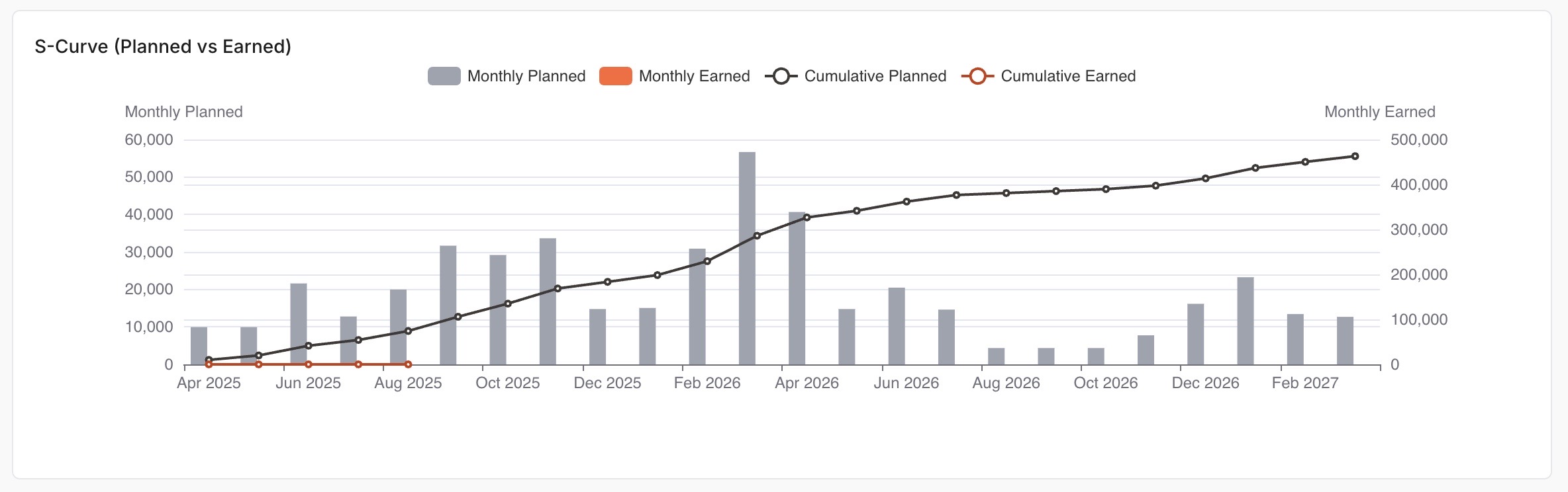
Stop wasting hours trying to extract and plot S Curves from Primavera P6. With Opteam, you can instantly visualize your project’s progress and read your XER file online.
How it works:
- Create your free Opteam account.
(Takes less than a minute.) - Drag and drop your Primavera P6 file (.xer) into Opteam.
No complicated setup. Just upload your file. - Get your S Curve—instantly.
Opteam automatically generates a detailed S Curve (Planned vs. Earned), so you can see exactly where your project stands. - See your project’s health at a glance.
Alongside your S Curve, Opteam gives you a clear overall health score—making it easy to spot risks or delays early.
It’s that simple.
Skip the spreadsheets. Impress your team and stakeholders with professional, ready-to-share reports. Try it now and see your Primavera P6 schedule in a whole new light.